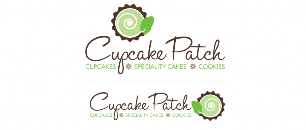
The Cupcake Patch was a local bakery that needed to refresh its logo and establish a “look”. Cupcakes represent something whimsical and playful and maybe a little feminine.
This shows the design process from concept to completion. The client was presented with initial designs that were refined to the final logo in both vertical and horizontal formats for a variety of uses.
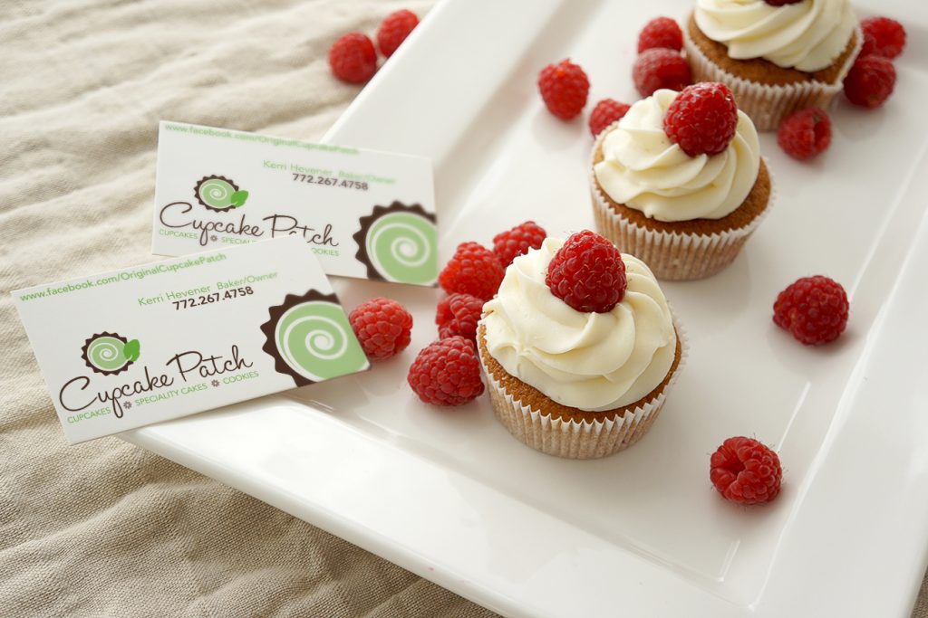
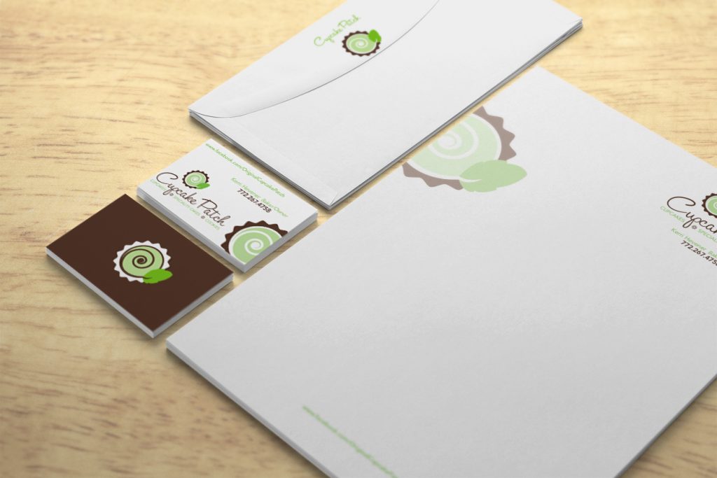
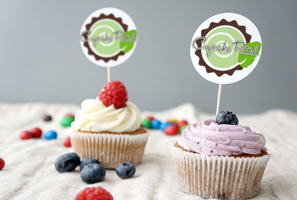
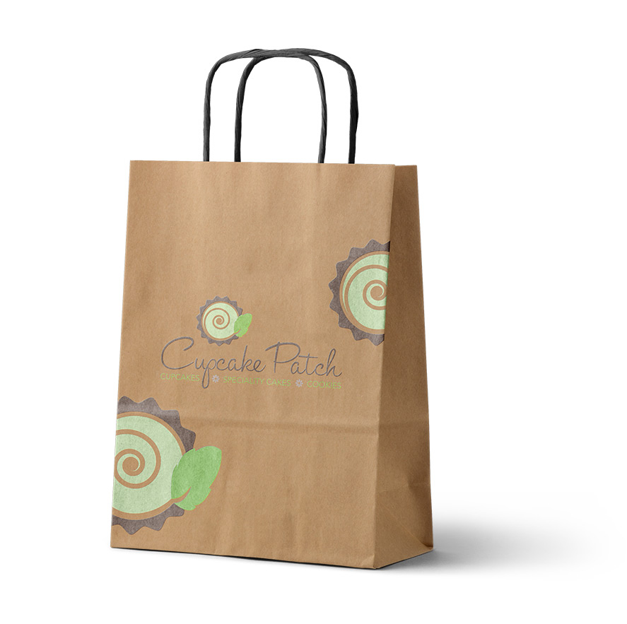
Also showed the client how the logo could be used to for branding and packaging.
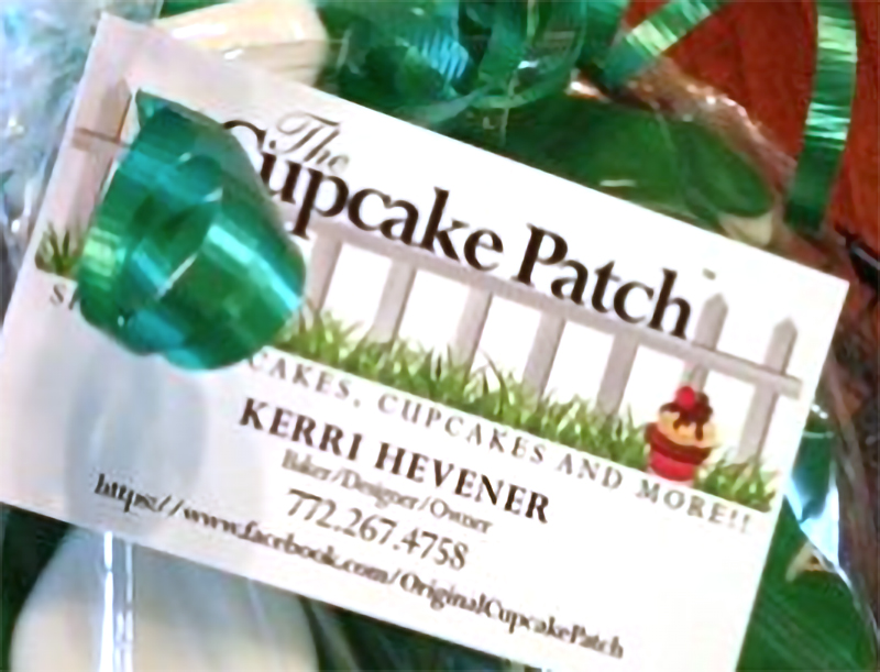
Cupcake Patch Original Logo
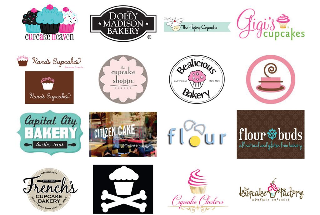
Research bakery logos
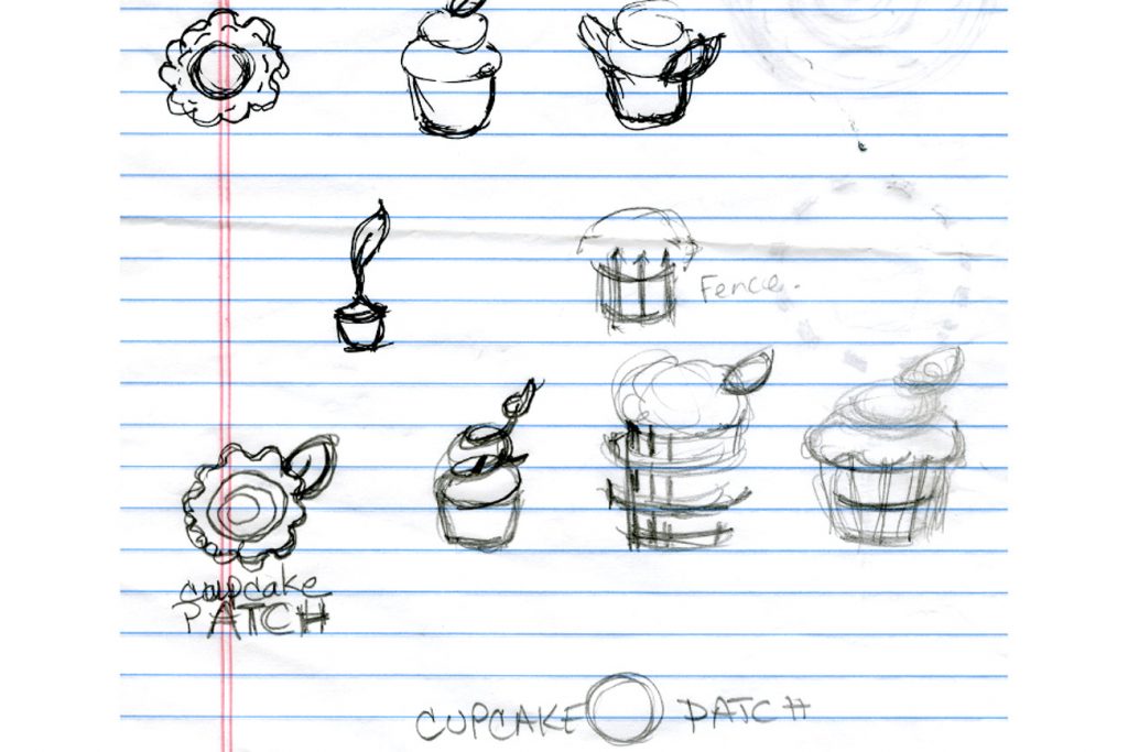
Sketch ideas
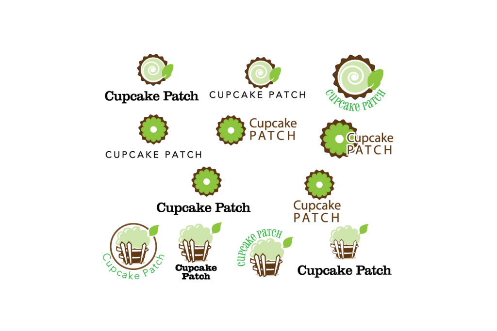
Refine ideas and research colors
The color choices were made based on the company name and logo. The earthly, chocolate brown and a minty green of icing that is also an earthy color found in nature.